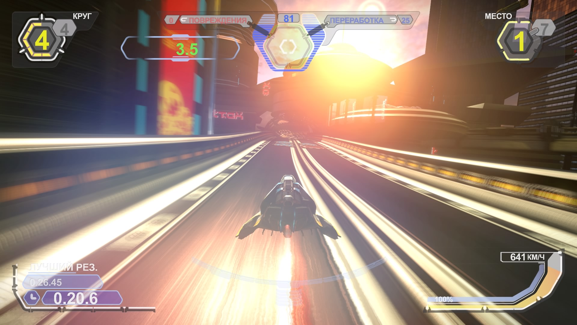


My speedometer’s design is based around a nautical compass as I could easy integrate the designs for a both suitable and visually interesting speedometer which fits my HUD theme.At first I used quite saturated block colours in the design but after receiving feedback which deemed it too unprofessional and simple, I developed it by adding metallic textures and a more intricate design. Originally, I added semi-transparent red backgrounds to my text for better visibility, however, using red, which matched the colour scheme seemed either too distracting when using a lighter tone or the text was harder to read against a background of a similar darkness. As the text was hard to read against a dark background I added a 10px white stroke around it and other elements of the dash for better visibility against both dark and light backgrounds. I used the font oceanography as it has a stylistic nautical feel but is also clear to read in capitals. The HUD has a nautical theme with a red and blue colour scheme. I based my HUD on the aesthetic theme of one of my teams.

WIPEOUT 2048 HUD STYLES SOFTWARE
The software used allowed me to create work to a professional standard as it is a top of the line software also used by professionals. I could then export the files into Photoshop where I could colour and alter the logos easily. In Illustrator I was able to create line-art easily using the shape and pen tools. To make these logos I used Illustrator and Photoshop. The font I used was called ” Celtic Hand” which fits my theme as it has a similar look as celtic runes in the way some parts of letters are thicker than others. The colours I used are a pink flower with a green overlay showing tinted transparent glass. This links to my team theme as the vial implies a potion which would contain herbs and flowers. My final logo, for Team Nitre, is a glass vial containing a flower. The font I used is “Stranger Tales” which is fitting for a macabre theme as it is slightly uneven which gives an abnormal feel and the white areas in the letters which makes the words appear scribbled. From feedback, I found that the use of two flowers makes the design too complicated so I altered the design to have one flower which allowed me to make the flower larger, giving it more definition and clarity within the logo. A skull is associated with the macabre which juxtaposes with a flower and the pink and purple colour scheme. My second logo, for Team Torvus, is a skull with a flower covering one eye.

It is bold and matches the theme with its serif embellishment. The font I used is called “Ocean” which is also used in the HUD. My final design used a blue and red colour scheme to which the HUD for that player correlates. I chose this as the anchor symbol is very easily recognisable and fits my theme. My first logo, for Team Xebec, is an anchor with lotus flowers on each side of the base. I wanted my game to appeal to the niche audience of girls who would want to get into racing games by not shunning the idea of femininity in a primarily masculine sport and game genre. My linking theme for all my themes and my racing game is femininity which is represented with flowers in all my logos. My three teams are Team Xebec with a nautical theme Team Nitre with a druid theme and Team Torvus with a macabre theme.


 0 kommentar(er)
